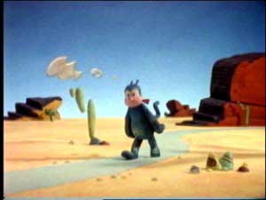
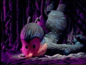
A studio called Banana Park recently produced a short adapting some George Herriman’s Krazy Kat strips using 3d computer animation (they claim it even made an “Oscar nomination short list” whatever that means)… you can see a short, tiny sample of the results and some stills from it here.
While obviously these are talented and competent folks who are sincere in their efforts, this just looks hideous to me… and I don’t think it is really their fault. Some of their other work looks great. Krazy Kat just doesn’t translate well to film in my opinion, and she REALLY doesn’t translate well to 3D.
They didn’t have much more luck adapting the charm of Krazy Kat to the screen in 1916…
They’re all right cartoons, sure, but they really don’t hold a candle… hell, they don’t even hold a wet match… to Herriman’s masterpiece. This is for a number of reasons I think.
The most obvious reason is that Herriman didn’t have a clean style… his characters were rough and scratchy and different in different panels. This isn’t generally done in animation, and it is pretty unheard of in 3D animation, since you have a computer model that you are moving around in 3d space. Non-canned (i.e. automated squashing, stretching, twisting, etc.) alterations to the model take a lot of effort. The rough lines on the 3d model of Krazy Kat in the pictures above just seem ugly, a pathetic and ridiculous effort to capture the charm of Herriman’s scratchy drawings. I have the same complaint about the Krazy Kat toys I’ve seen come out in recent years. Krazy just looks totally wrong in 3D… she just wasn’t designed for this dimension. I mean, the Kat has been known to peer over the horizon line! What are they thinking?
Another less obvious reason is the way Herriman made the characters live on the page through drawing them the same size and often from the same angle repeatedly… this gives the strips an intimacy in a way that I don’t think can be translated in any other medium. This is a lot of what makes the characters seem like “little sprites” as Herriman poetically put it.
All these cartoons are mercifully silent, although I would guess the 3D one probably has sound that is not on the sample. I pity the voice talent trying to compete with how Herriman’s off-kilter and poetically accented dialogue reads in one’s head.
I could be wrong about all of this though… Walt Kelly’s Pogo would seem to be very hard to adapt for many of the same reasons, but I love the stop-motion animated “I Go Pogo” movie (I’ve never had the opportunity to see Chuck Jones’ “Pogo Birthday Special,” unfortunately). It’s not as good as the strip, certainly, but its as good of a film as you could hope to make out of the Pogo characters, and it is gorgeously animated. So maybe someone could do a good Krazy Kat cartoon someday. Seems like a damn waste of time to attempt it though, when your chances of doing something half as good as the source material are slim to none.
Going off on a tangent, I find it depressing that 3D animation is often considered inherently superior to 2D animation, as if the point of a cartoon was to be realistic. 3D can be charming in the hands of good animators, don’t get me wrong… I love all the Pixar movies. But there are two things that 3D computer animation will most likely almost always fail miserably at… extreme realism, and extreme, off-model cartooniness. Krazy Kat obviously falls into the latter category.
(Note: Ironically, I have many of the same gripes about my largely unsuccessful 3D homage to the Fleischer Brothers, Take Me Away From the River.)


